Nick,
I think the font is a great way of making bringing the AAOT concept to life.
Could you add the functionality of all the arrows with the ablity to rotate (similar to a row of gauges on the dash of an automobile) to show the average angle of trend over each of the different selected time frames. This could be accomplished by using something similar to the auto-ranging formula for calculating the automatic pip scale changes to the right side of the Marketscope 2.0 screen. This angle would indicate to the viewer the amount of movement for each time frame, thereby enabling the viewer to distinguish at a glance if the market is flat, grinding up/dwn, rocketing up/dwn etc, for each time frame.
However I think that we only really need the angles pointing from straight up (green), and then clockwise all the way through to pointing straight down (red). So basically 180 degrees of rotation up and down, covering what would be 12:00 through 6:00 on the face of a clock. I think that this is important because the arrow or dial should only rotate up or down to reflect the Average Angle of the trend over that selected time frame.
visually allowing the user to see the when trends are forming. For example - a horizontal arrow would indicate 0% of change. An arrow pointed up 30degrees from horizontal would indicate a 30% avg change long. Whereas an arrow pointed down 70 Degrees would indicate an avg change of 70% going short.
The visual depiction of arrows rotating on their axis is the most important part of this idea. It allows the user to visually see a complete picture of any given currency pair across all selected time frames at as glance. The user looks for arrows that are all beginning to rotate and line up at angles similar to each other thus indicating trends forming. Arrows rotating in a row is much easier to visually interpret than a table of numbers. Once you have decided on a currency pair to focus on by seeing the Simple Dealing Rates page then you would look to your Marketscope screen with the AAOT as an indicator applied to that selected currency pair only.
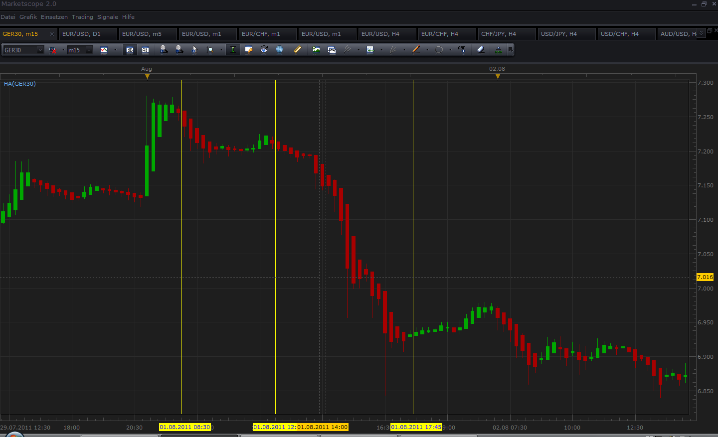
On the Multi Time Frame-HA if you give the arrows the same ability to rotate as an indicator this allows you to have the same Average Angle Over Time information for the particular currency pair being actively monitored on the Marketscope Screen.
I got the font and demo to function correctly. I am curious to see how you and your team will integrate the function into the Multi time frame HA indicator, and once perfected, ultimately integrating them into the Simple Dealing Rates page of the Trading station itself!


 MarketDings.ttf